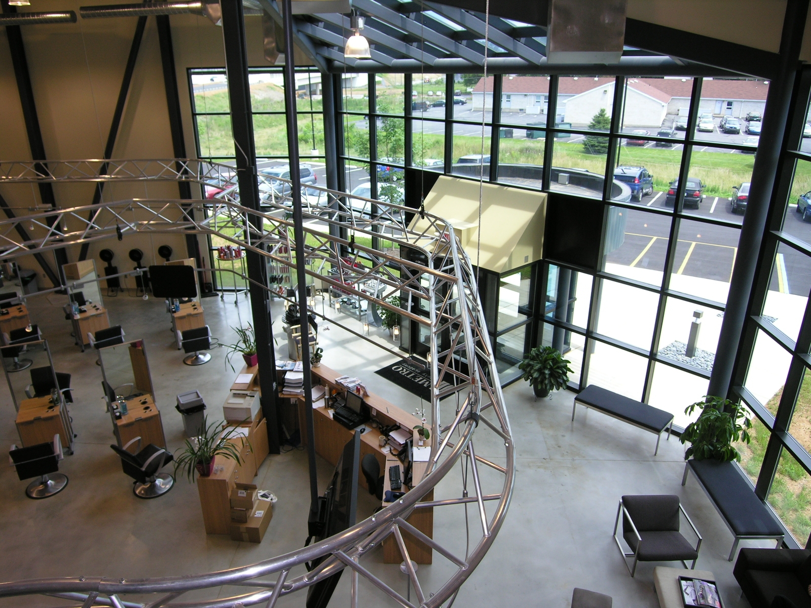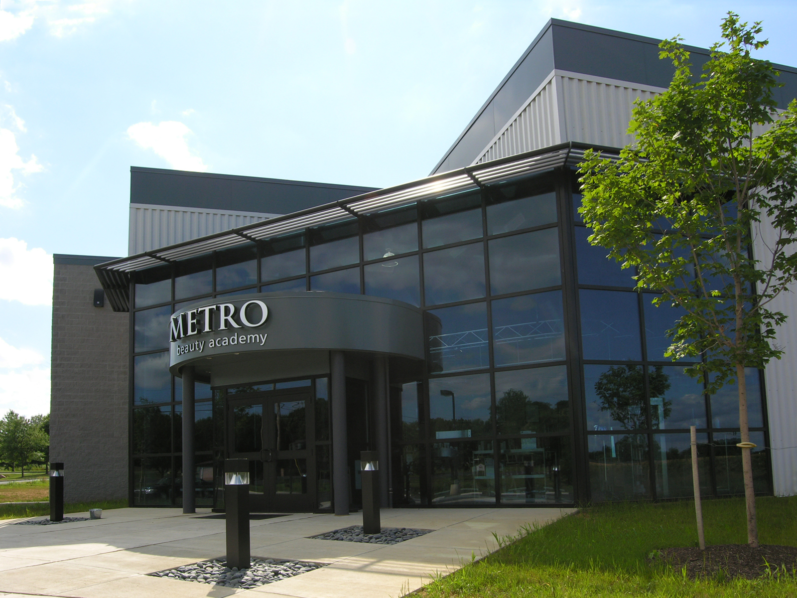
The building has inviting appeal to it. The exterior entry gives a desire to see more; you want to know what’s inside. The Architect utilized an open design concept to unite the spaces and give a visual connection. This design with the 2-story glass walls reveals students working to passersby. The building even has a luminous glow at night.
Running thru the large studio is a ribbon of a triangular truss. The curves of this unique truss emulate curves of hair styles and functionally provide spot lights to style-stations. They also provide lighting flexibility when the space is converted to a space for “runway shows”. All style stations are movable. Shading devices outside on the curtain wall diffuses the natural light.
Walbert Training Center Allentown, PA
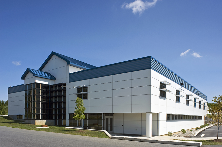
The program for the building was to create classrooms to train management, safety and linemen/electricians from office procedures to field skills in one convenient location. The original building was one story approx.. 24,000sf. The design seemed disjointed with varying finishes and heights. New design added a 2 story 25,000sf addition and used aluminum composite panels to give it (glossy) high tech look, along with sunshades. We maintained texture with ribbed siding running horizontal at the top of the façade.
Central corridor is a wide space well lit by natural light from transom windows. It is a gathering space and used for serving luncheons with areas for breakout groups and docking stations. We used textures from the exterior, inside. Introduced wood soffit lights to soften the space, and columns to provide interest and lend to the proportion of the room. Width and height is the same dimension. Colors are soft.
The single round column that sits in the middle of the open stairs between floors represents a link, rounded and smooth, unifying the working ranks of the company to the management side. The column is the only round feature in the building.